


Visual Harvest: Part One
A concoction of fresh findings rooted in creativity.

Gather round’ friends. I’ve been busy collecting and curating things found on the corners of the internet that ignite my spirit. I’m developing a new series called Visual Harvest, encompassing snippets of creative and cultural discoveries. This is very much a take what you need, a visual offering, and a healthy distraction while the world seems to be festered with turmoil. So welcome to Visual Harvest, a series that aims to push beyond surface-level, perhaps even the overlooked, which I hope will inspire you for more than a hot second. The central theme of today’s curation is: colour!
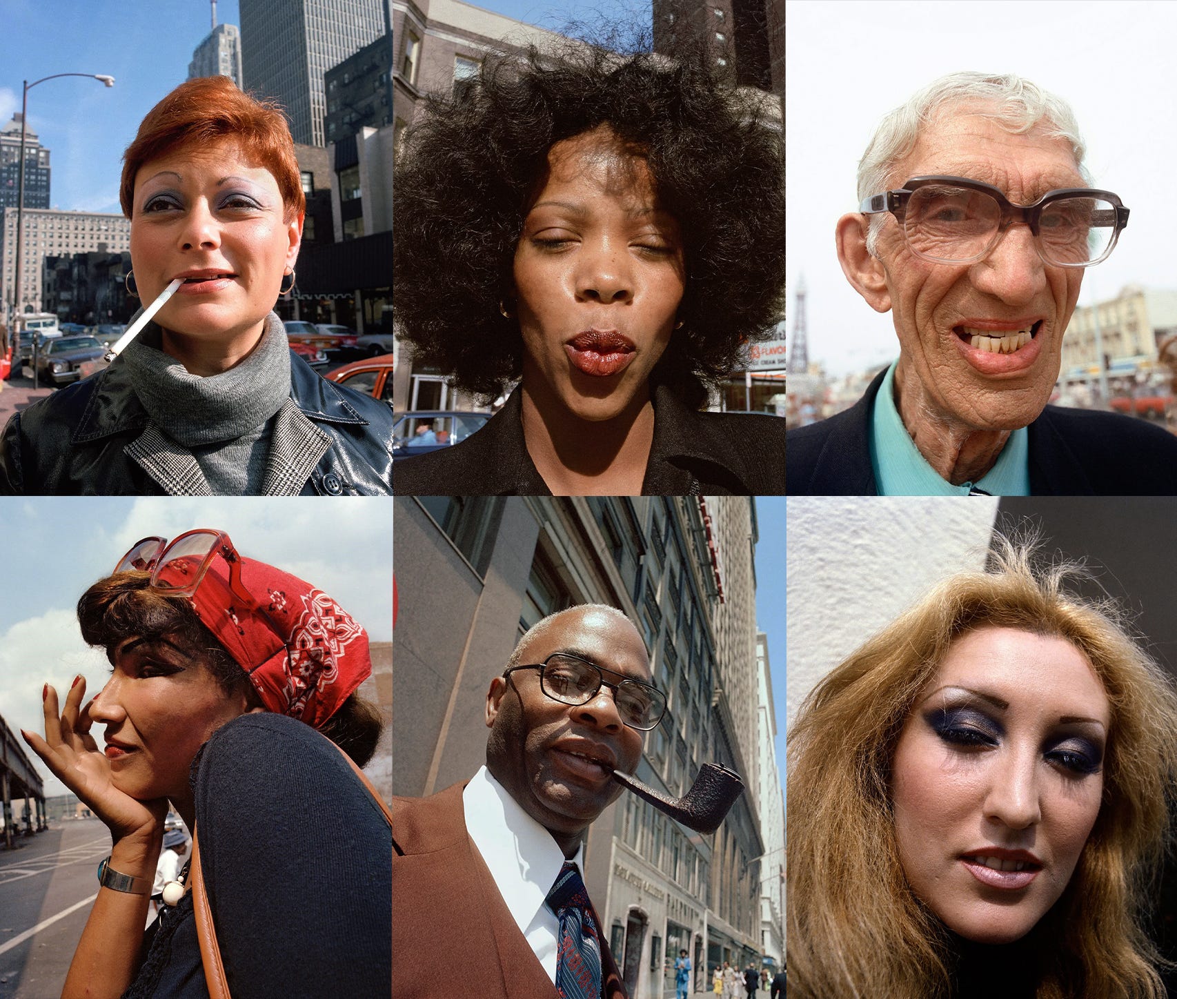
In Portrait Photography
These portraits look straight out of a Nadia Lee Cohen campaign, but surprisingly they’re not. These are from a time when blue eyeshadow was all the rage, and the bigger the hair, the better! They are “A series of street portraits by Charles H. Traub, captured between 1977 and 1980 in Chicago, New York, and Europe” which has to be some of the most honest portrait photography I’ve ever seen. To me, the subjects appear as if they are having a genuine interaction and suddenly, in a nonchalant approach, Charles H. Traub clicks his camera..1,2,3 times, and what remains are portraits that comprise raw emotion, grit, and realness. Each subject looks like they have such gumption and zest for life! His ability to capture the soul of each passing subject in their natural state is what the world could use more of. Amplifying more realness. More human. No cookie-cutter, ai-generated, etc. You know what I mean.
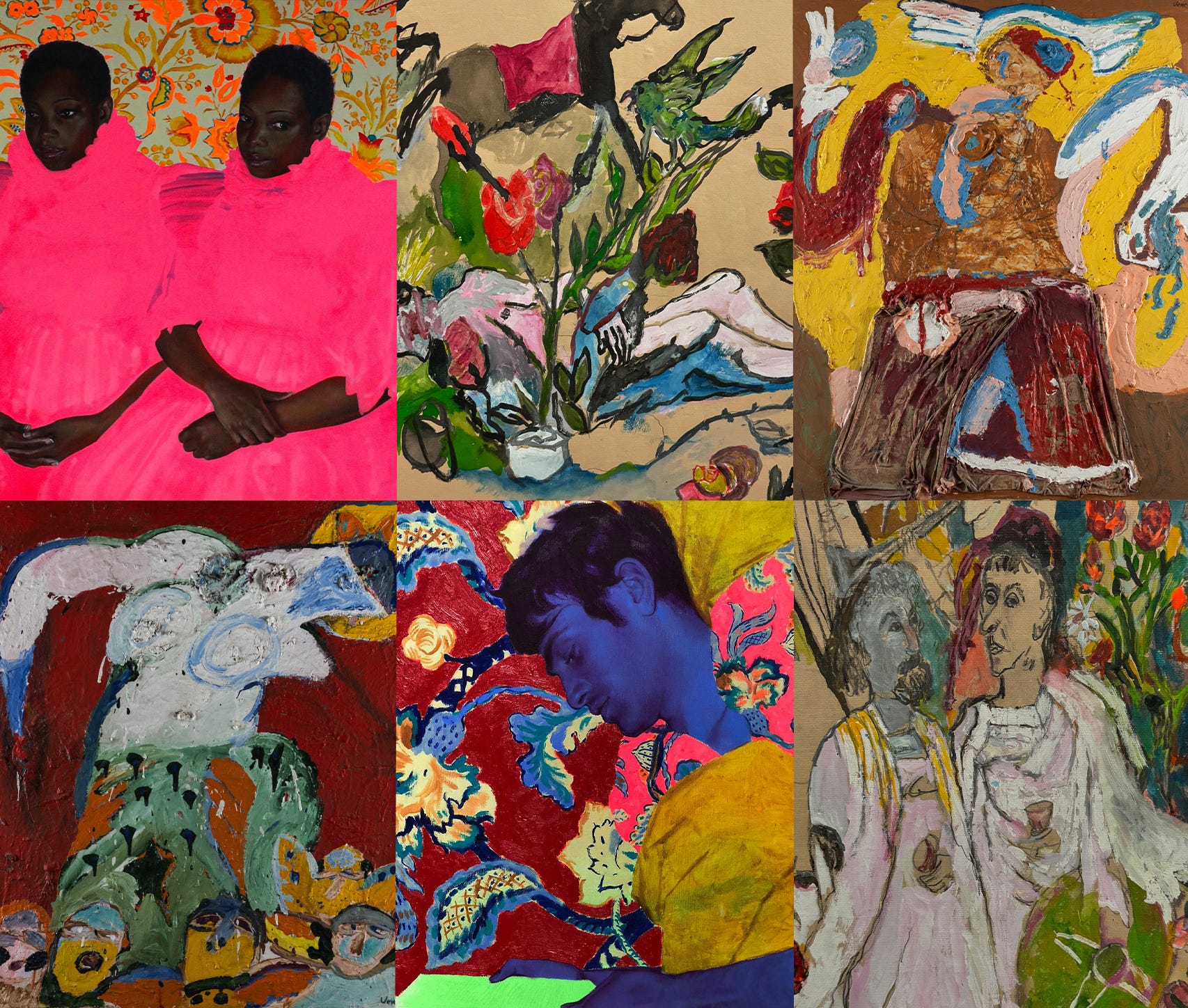
In Art
And then we have a sea of vibrancy. Chunky strokes, a theme of floral patterns, and colour pairings so bright that they energize you at first glance. These artworks are all an ode to colour. I have admired the work of Michael Slusakowicz for quite some time—the portrayal of each character displays a deep gaze as if they are lost in thought. The emotion exuding in each portrait, paired with seamless details and satisfying colour palettes is simply breathtaking. Moving along to Anna Boghiguian, her paintings touch on historical movements and figures, with layered compositions, thought-provoking storytelling, ragged brush strokes, and an eruption of colour. Last but not least, Germán Venegas’s work from 1982 blends Mexican identity, folklore, and contemporary expression. All works are beautifully articulated through depth, intellect, and colour.
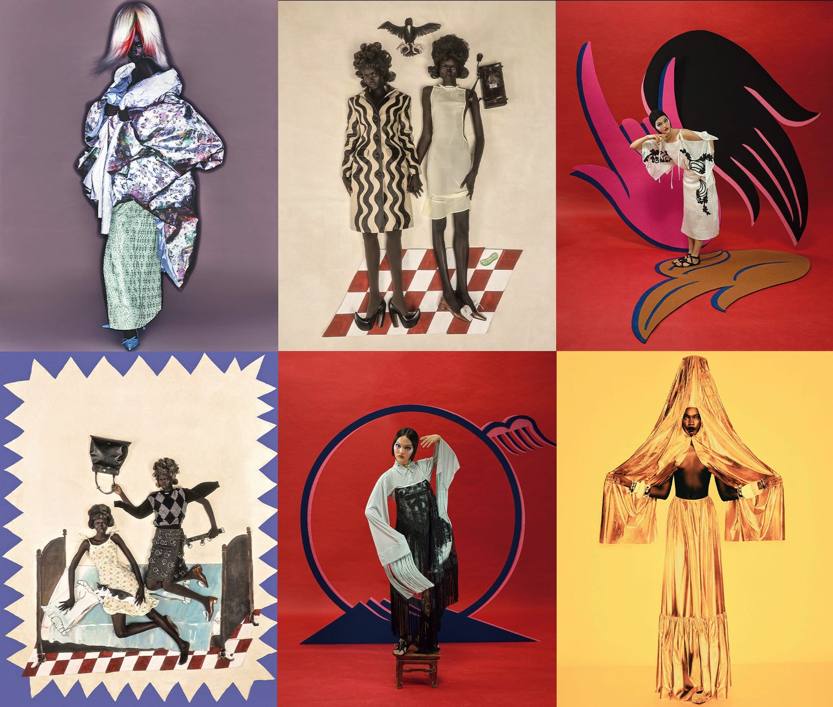
In Fashion
An image can’t just look pretty these days, as it’s not enough to stop the thumb from scrolling. And, the product shouldn’t be super obvious, either—in our faces = no-go. No, instead it should be obscure with storytelling so good that it transcends you into another realm and sparks your imagination! And that is exactly what Rafael Pavarotti did for this shoot with Adhel Bol for Perfect Magazine, Issue 8: Pin-Ups. The concept is drencheddd in majesticness and divinity. I could go on about how much I love these editorials, but let’s move along. Next, it’s Szilveszter Mako’s ‘Sorellanza’ for Numero Magazine, a series of images that transport you straight into your dreams. Each frame tells a different story and the execution is so well done that you don’t want the story to end. Unreal set design, too. Concluding with Puppet Play for Vogue Me China by Zhang Chao, it expresses heritage, interaction, and vibrancy paired with oversized silhouettes and exaggeration. It’s quite a feast for the senses and one that I can revisit time and time again.
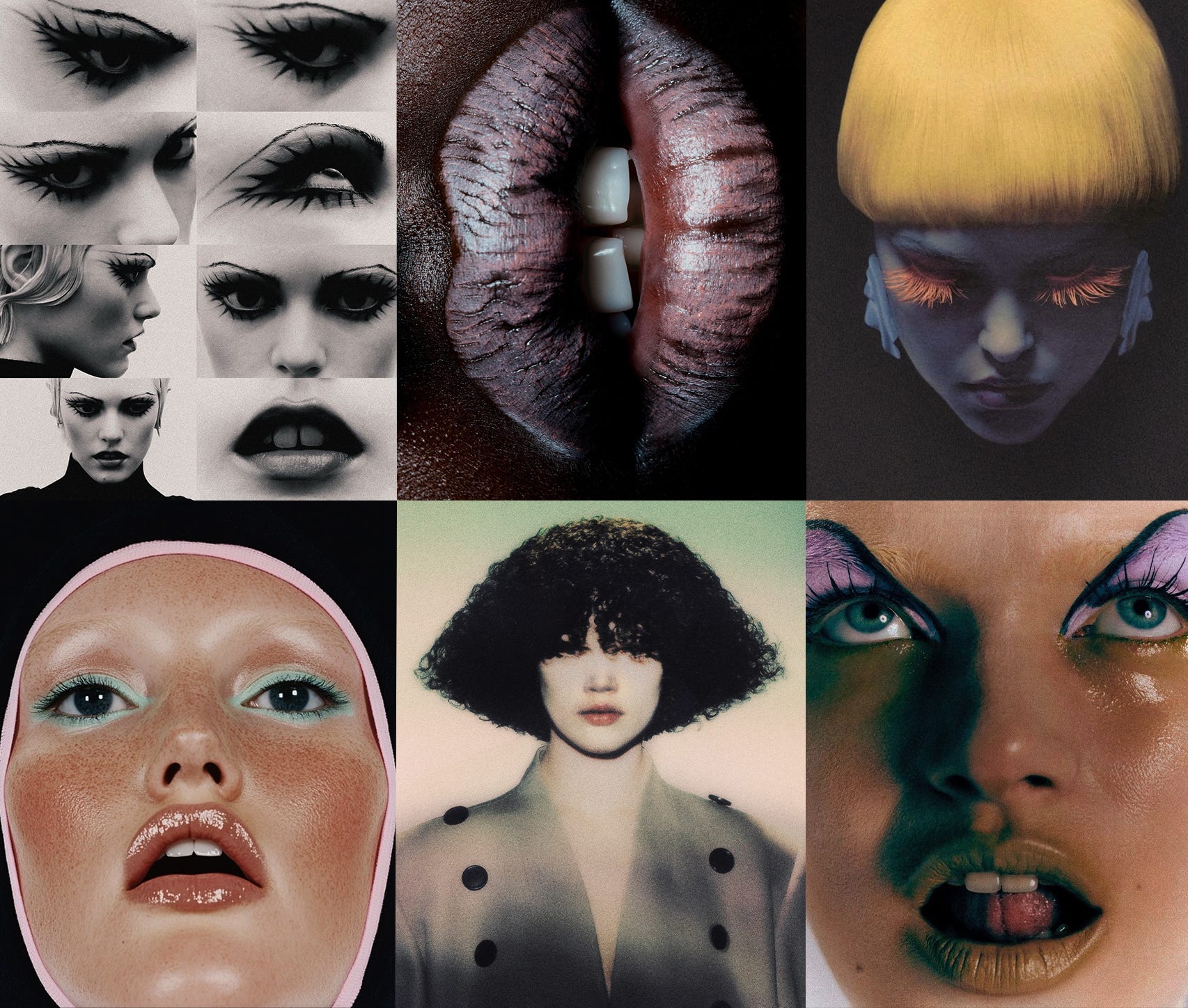
In Beauty
These images are serving it’s purpose for the creative tincture I needed. And they are anything but boring. Each frame serves up a cup of main character energy. The looks all sound like a staccato (staccato: performed with each note sharply detached or separated from the others). I don’t know what I adore more about each beauty editorial but combined, the mood is theatrical. I think it’s easy to say that I appreciate pristine silhouettes, sharp lines, vivid colour palettes, and an avant-garde aesthetic. Every single shot is like a fine art print that I would gleefully hang on my walls.
When building out the moodboards, the reveal is gradual. Each pulled image communicates what I gravitate toward. And when the moodboard is done and dusted, it’s like a jack-in-the-box jumping out at you with the common thread finally revealed. While it’s a challenge to differentiate yourself from the pack as we all have access to much of the same sea of content, I relish seeking out common themes to piece together a moodboard that conveys the vibe I want to achieve. It’s the building blocks to defining my DNA as a creative.


Slow curtain, the end. That’s a wrap for my visual digest and a tincture of creative fuel to shape your next project, or hopefully, it catapulted you into curiosity and creativity.
I’ll leave you with this…
“Pay particular attention to the moments that take your breath away”
— Rick Rubin
And ask you this…
What has been inspiring you lately?
Lastly, tell me what you want more of…
Thank you so much for reading!
XX,
Dominique
This feels like flipping through the dream section of my brain. Every pull, every palette, every word — artfully curated and full of soul. You nailed it.
This whole breakdown is chef’s kiss—love how it flows like a moodboard in itself. The way you talk about color and emotion in photography? Spot on. Those Charles H. Traub portraits really do hit different—so raw, so unfiltered (literally). And Rafael Pavarotti? Say less. His work always feels like stepping into another dimension. Excited to see where this series goes!